MOWI ASA


Overview
MOWI ASA is one of the largest seafood companies in the world.
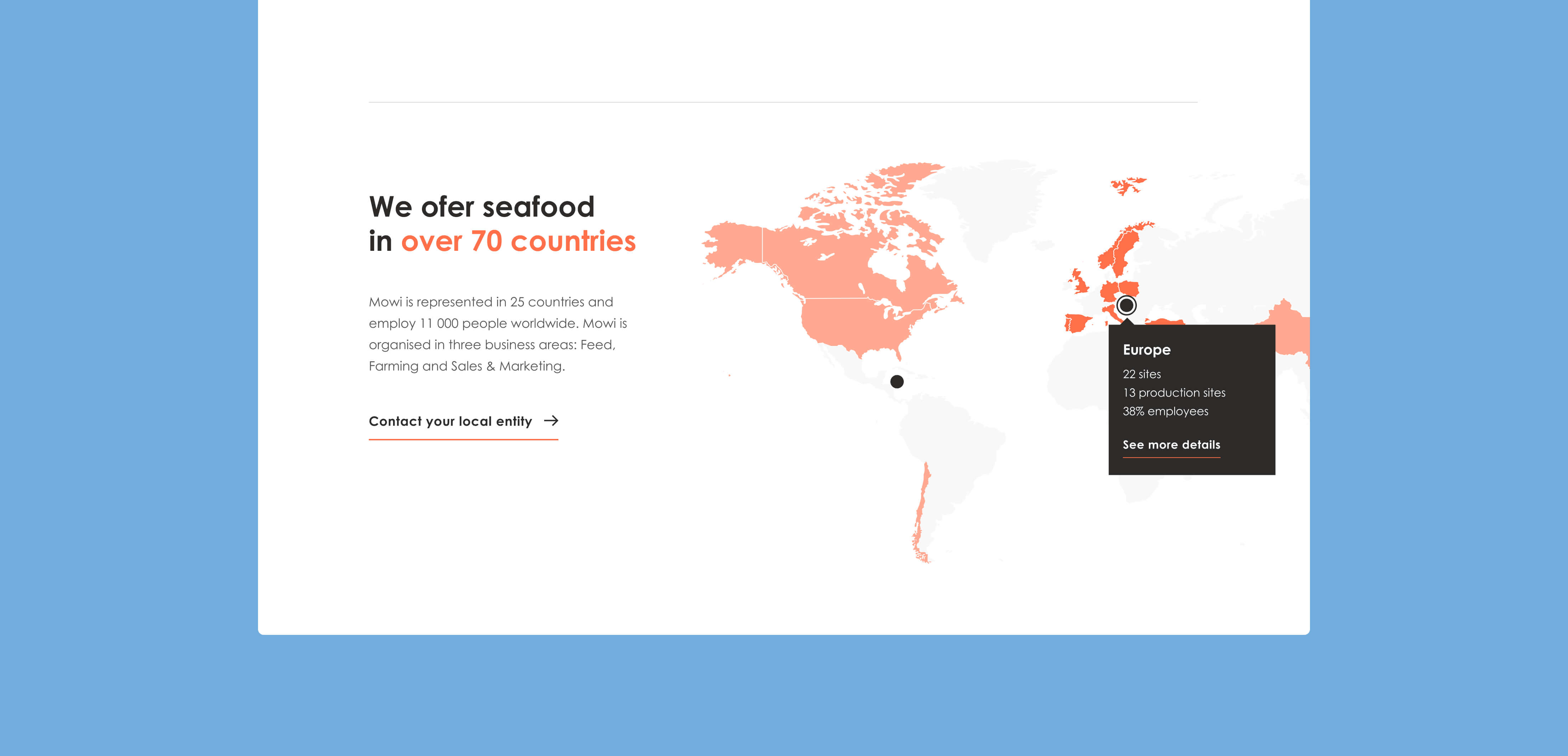
Headquartered in Bergen, Norway, the company operates across 70 countries. It delivers a range of fresh, healthy seafood products and puts a strong emphasis on responsible sourcing and high sustainability standards.

Context
MOWI’s corporate website serves a global audience and needs to work at scale — the platform is available across 23 countries on three continents.
Beyond being “just” a brand site, it supports a wide range of corporate communication needs: meeting the expectations of a listed company and investor relations, addressing regulatory and compliance-related information, and presenting the company’s profile, activities, values, and strategy in a clear, credible way.
The previous design dated back to the early 2000s and had simply stopped reflecting where the company is today. Over time, it accumulated many incremental, point-by-point fixes, which made the experience feel inconsistent and harder to maintain.
As a result, the site struggled to support a positive first impression and had noticeable usability issues — especially around navigation, content clarity, and finding key information efficiently.
Approach
Together with the MOWI Global Marketing Team, we started with a focused review of the existing website, where navigation and content clarity were holding users back.
From there, we looked at each group’s needs and patterns, using insights from analytics and Hotjar to shape a clearer information architecture and a more intuitive navigation model.
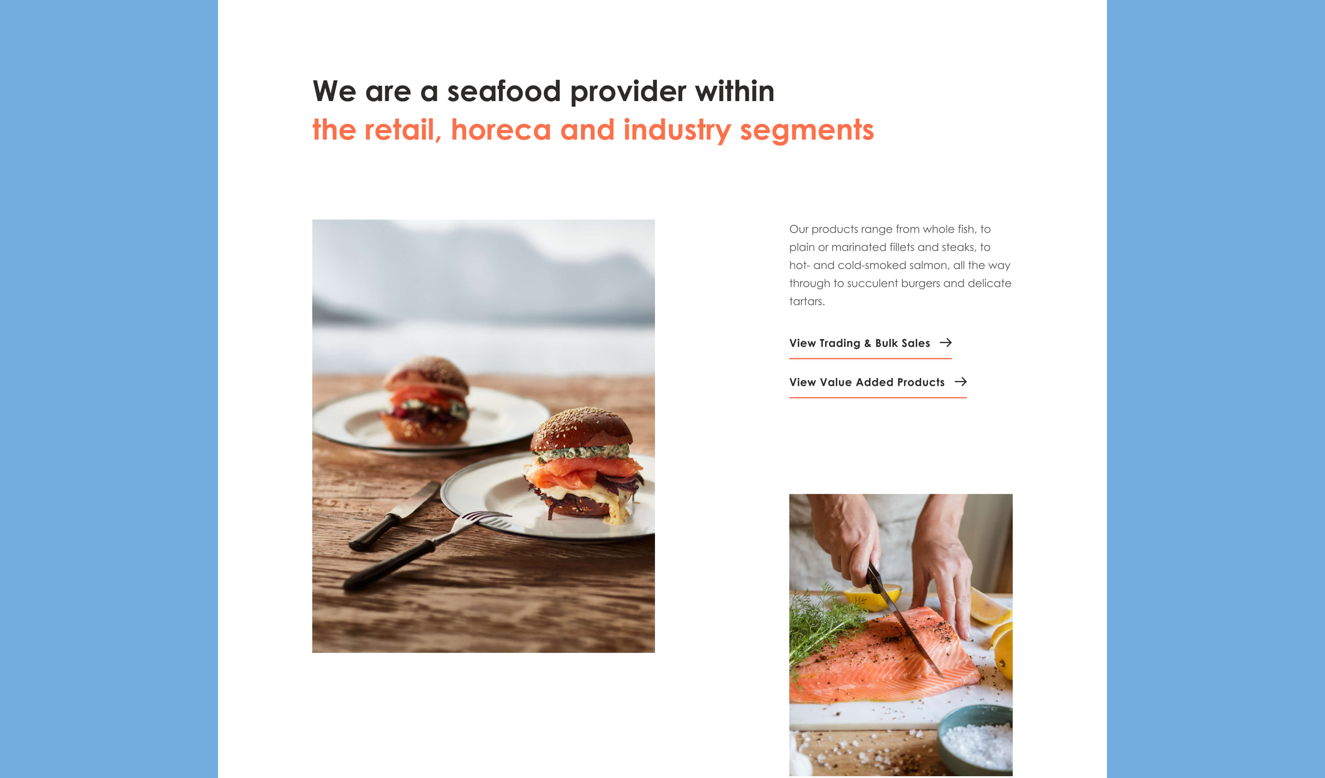
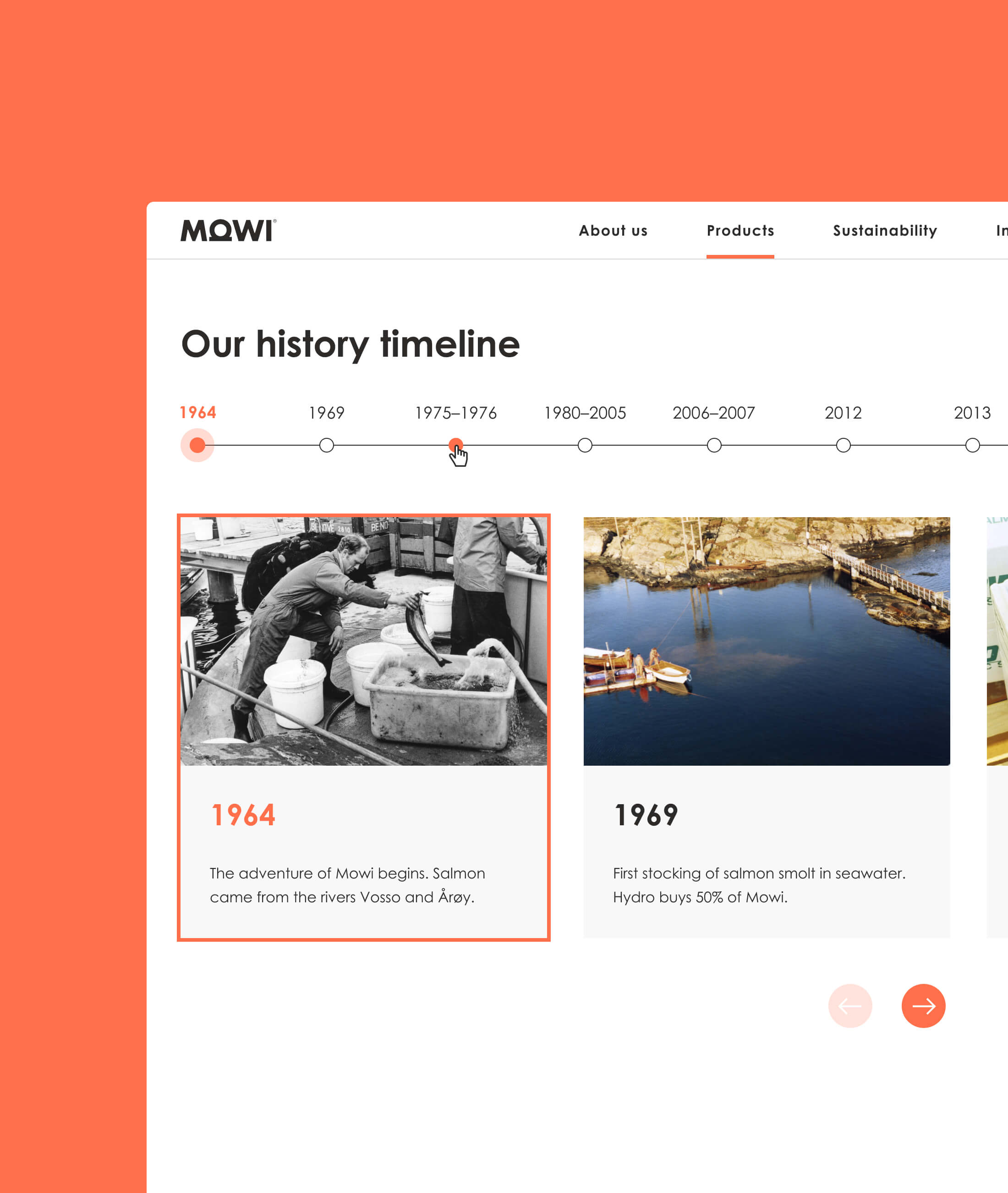
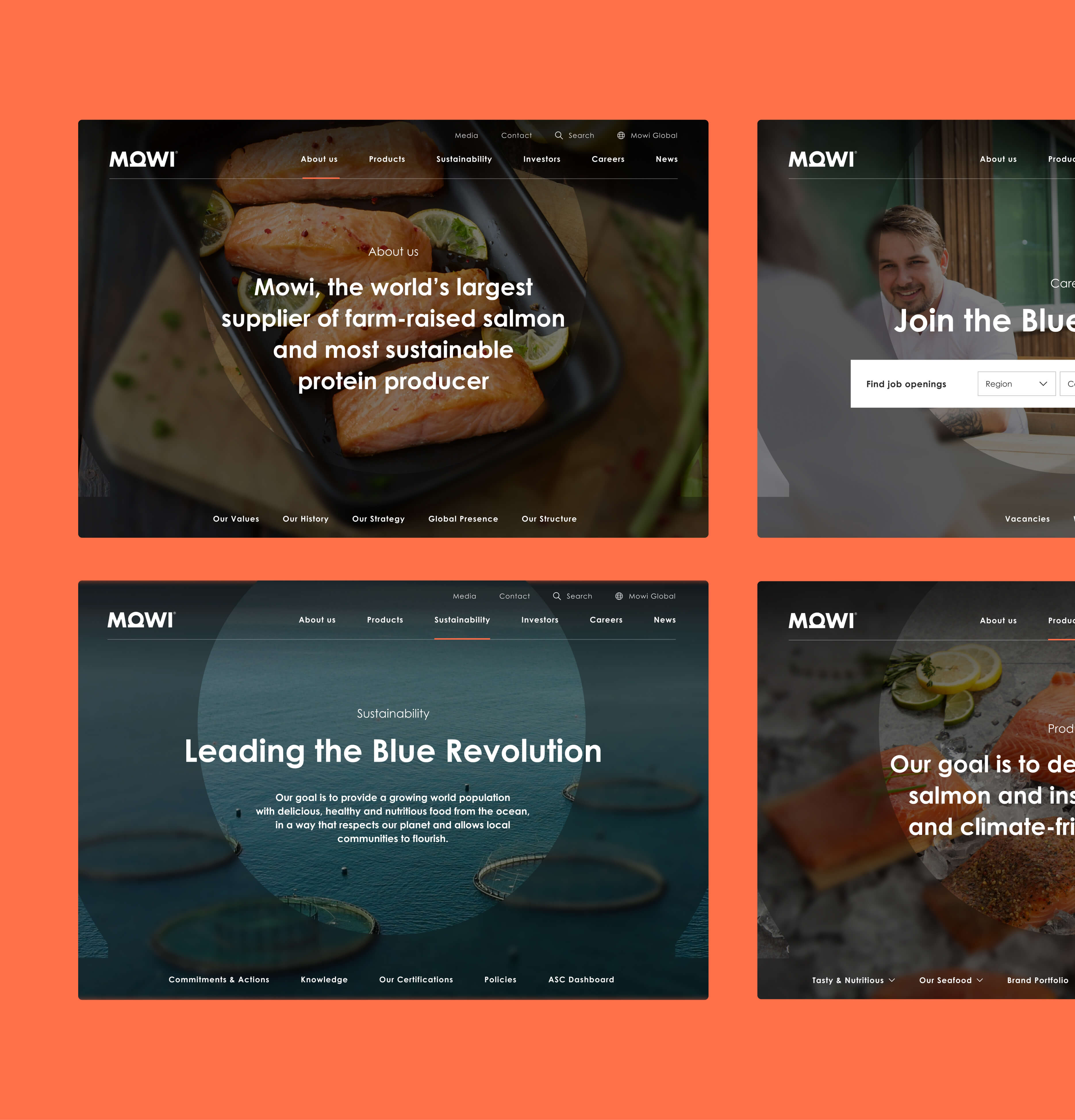
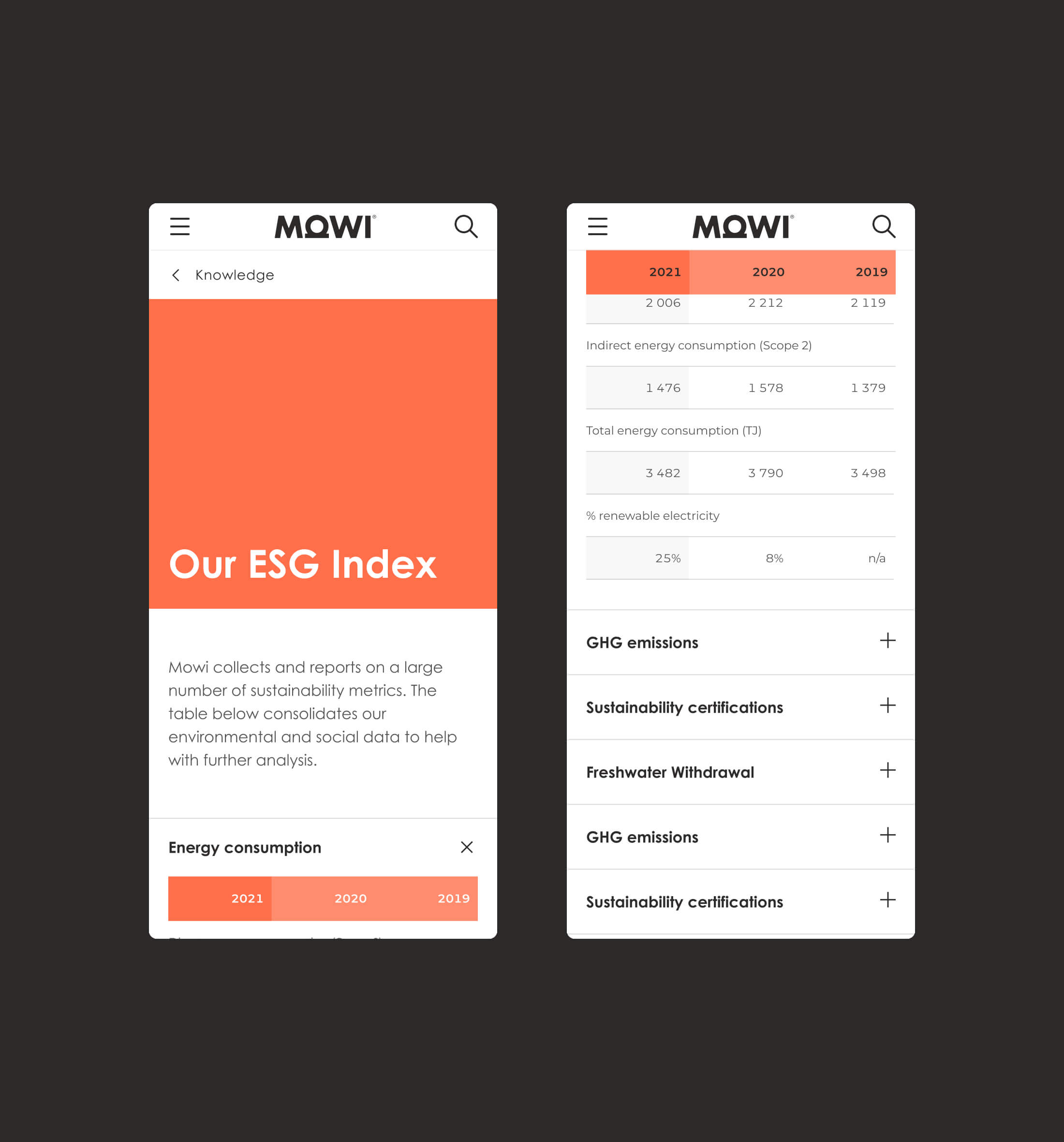
The new layouts needed to support very different content types — from regulator-driven datasets presented in tables to more consumer-oriented, food-industry visuals and editorial content. At the same time, the site had to communicate the company story in a way that feels professional, engaging, and easy to browse.
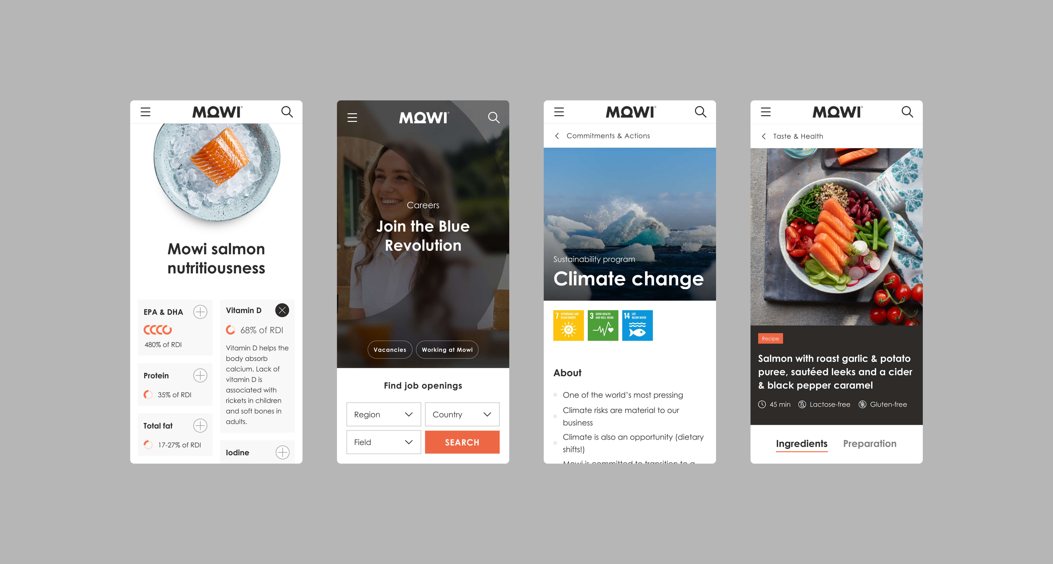
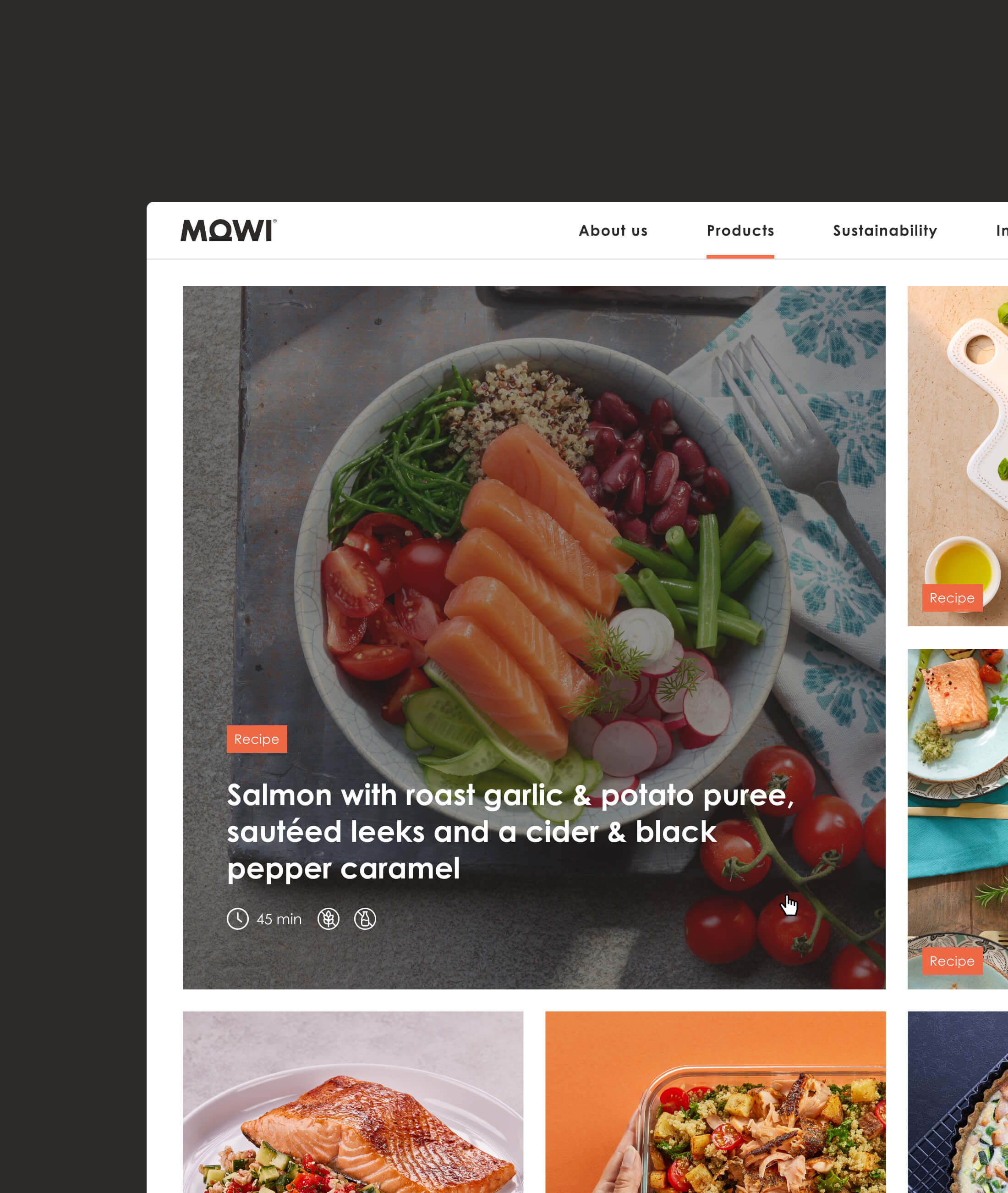
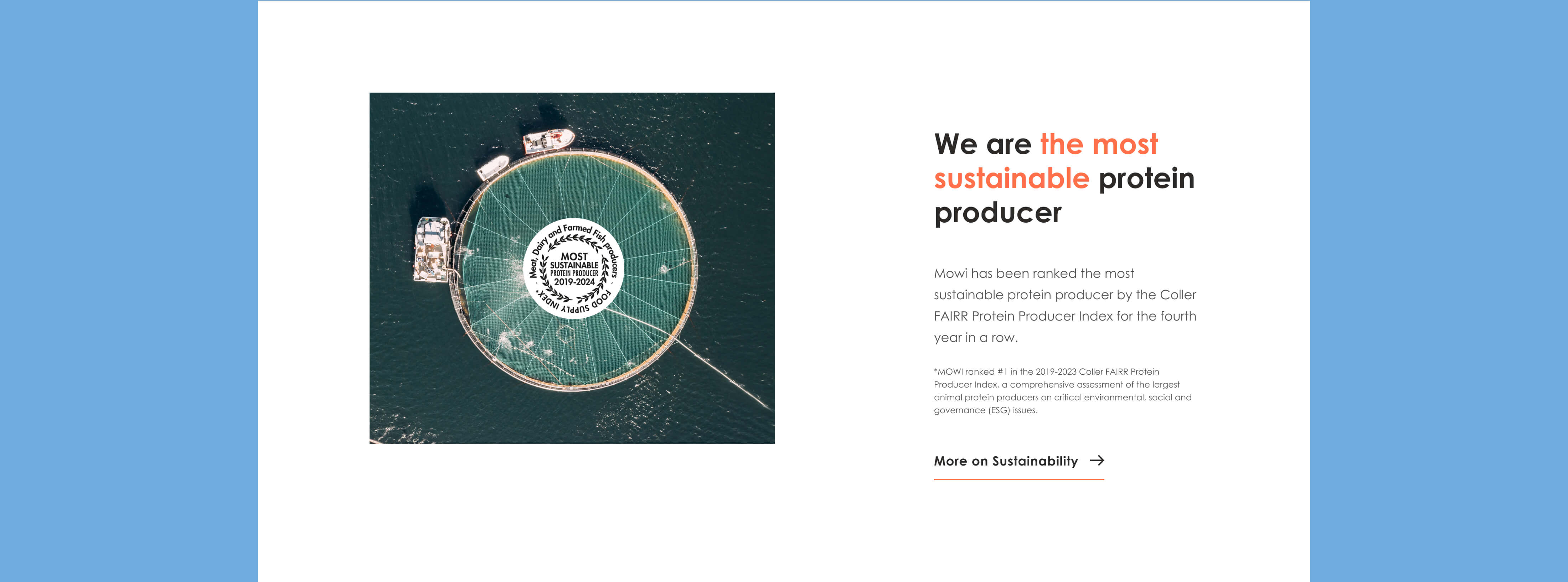
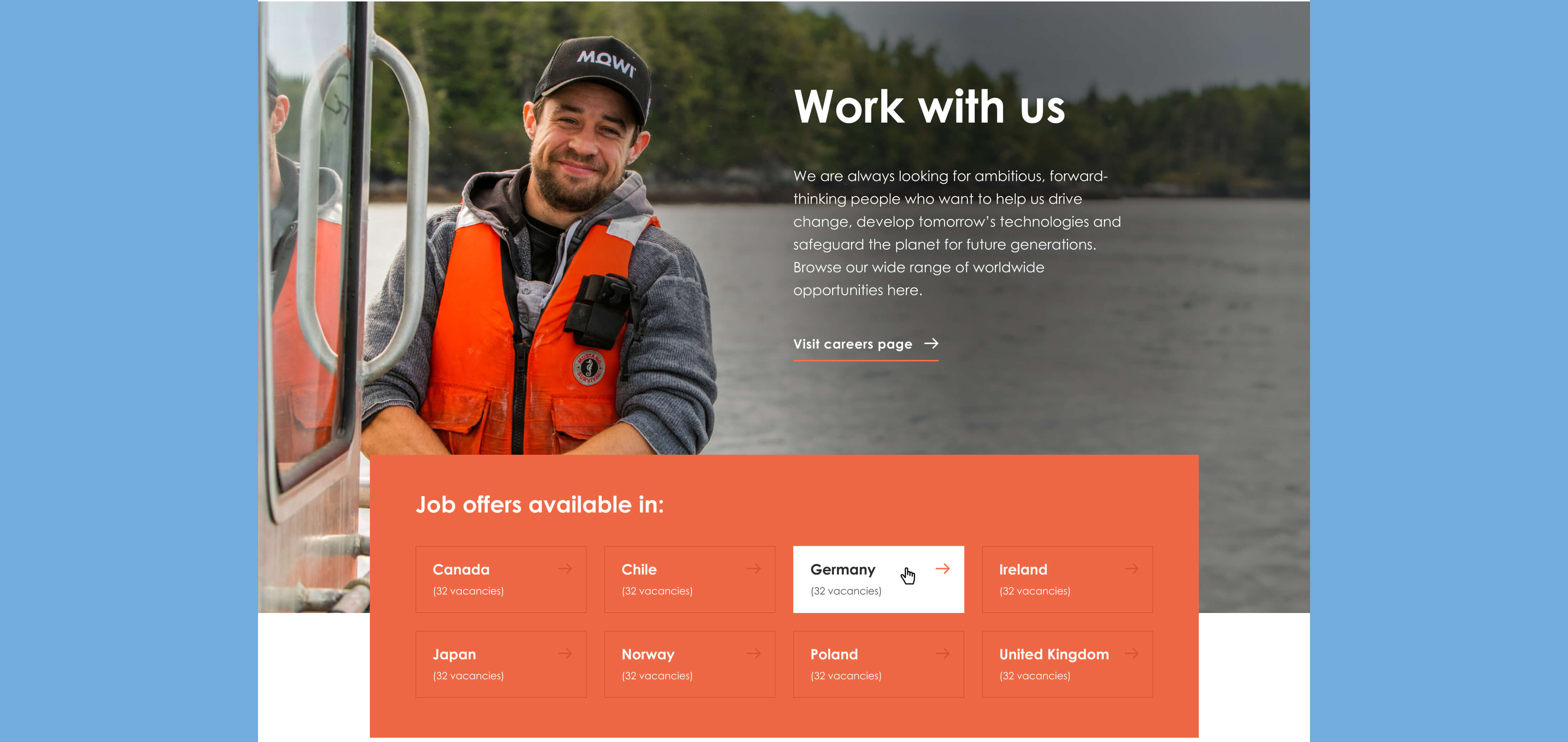
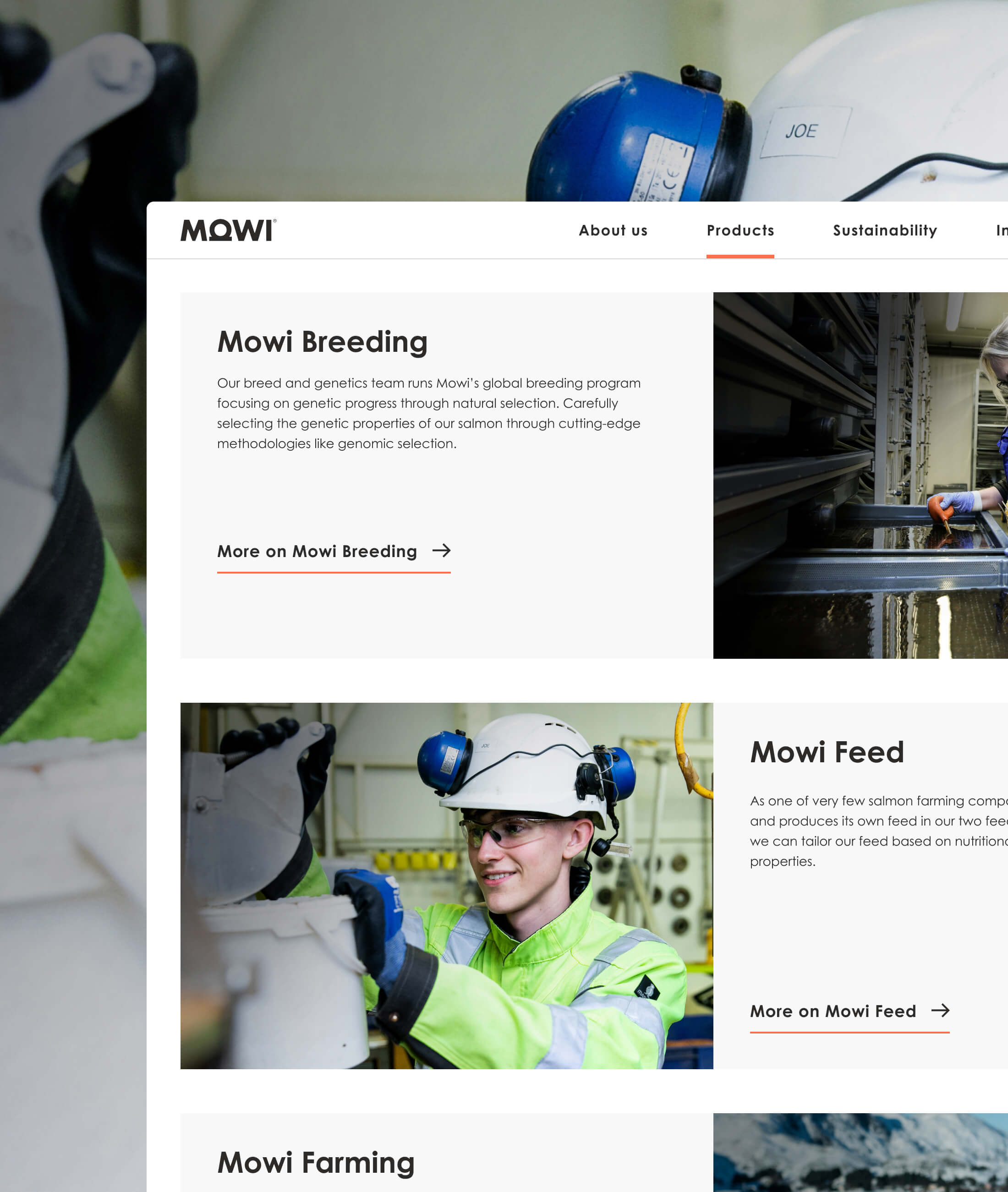
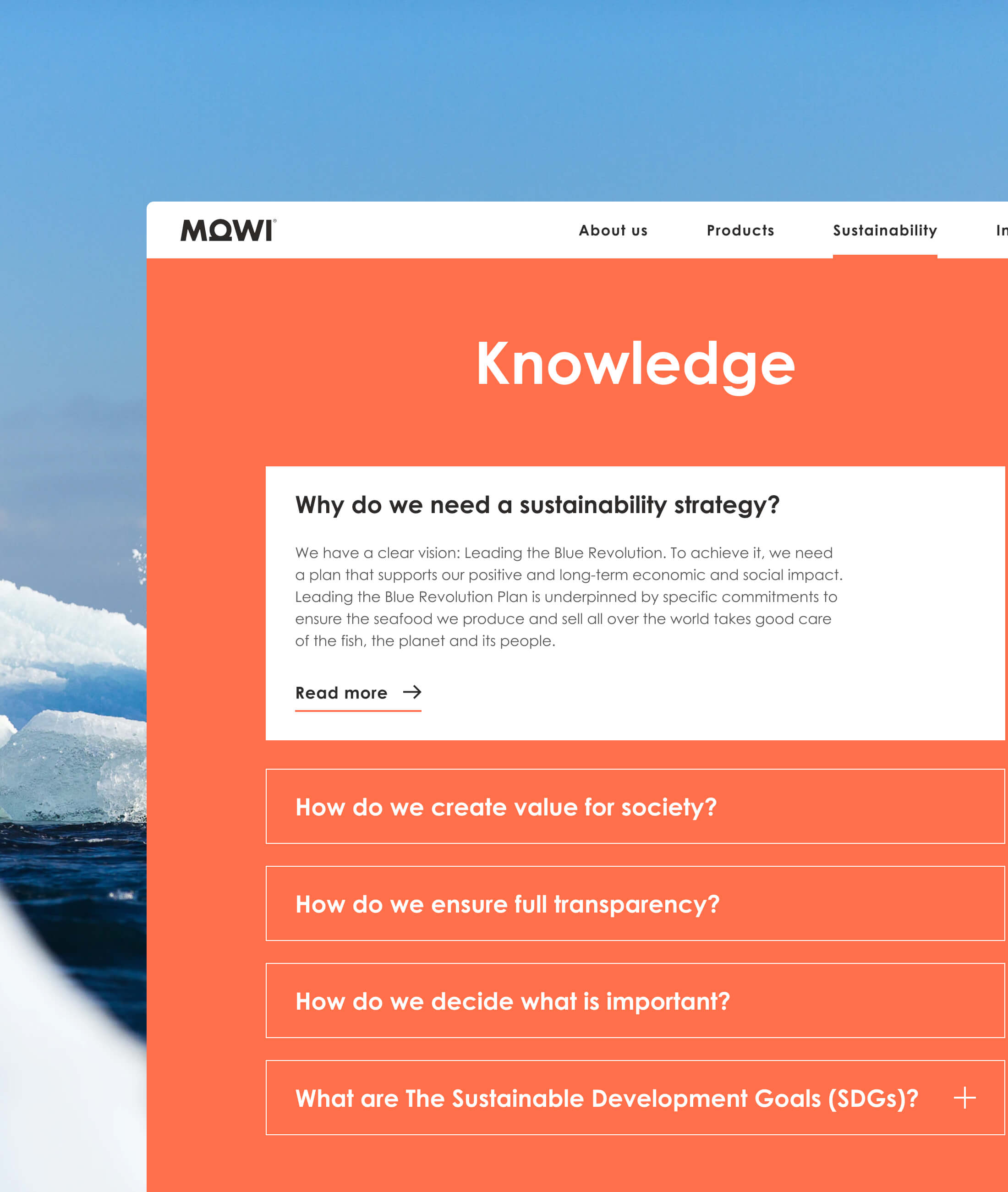
After defining the structure through wireframes (page hierarchy, content overview, and key layout patterns), I developed a refreshed UI aligned with the brand guidelines. Clarity, Scandinavian minimalism, and generous whitespace became the foundation of MOWI’s updated visual language.
Outcome
The resulting interface supports both large desktop screens and compact mobile views, while keeping the experience consistent and straightforward.