MOWI

UX and UI design of consumer websites for world's largest salmon producer
UX Design, UI Design, Design System, Work at mohi.to agency
2020 — 2022

MOWI is one of the largest seafood companies in the world and the world’s largest producer of Atlantic salmon.

The company is based in Bergen, Norway, and operates in 25 countries. It offers a variety of fresh, healthy and quality seafood to its customers and commits to maintaining high sustainability standards.

In a nutshell

  • I’ve been a designer appointed to MOWI in terms of UX and UI design for over two years, while working at mohi.to.
  • I worked on several projects ranging from creating new consumer website guidelines for all markets, improving corporate page usability, creating new e-commerce, and enhancing the experience of the QR code-based salmon tracking feature.
  • I closely cooperated with Mowi global brand management team as well as with regional marketing teams.
  • Apart from designing, I've been conducting workshops and presenting new design decisions to the stakeholders at Mowi global and regional headquarters.
  • Below I am showing details of the new consumer website design.

New consumer website design

The background

As MOWI was entering new markets, the company needed to completely redesign its customer websites to better match consumer needs. The primary features of the websites are:

  • clearly showing MOWI’s product offer,
  • enabling users to find online and stationary stores offering MOWI products,
  • improving the post-purchase shopping experience with recipes and detailed information about purchased salmon based on QR codes,
  • establishing and maintaining a positive brand image,
  • clearly showing the brand's sustainable production methods and environmental responsibility,
  • offering additional information on salmon as a dietary item.

The solution

I designed the website dedicated to the American market. This included creating a comprehensive UX structure that took into account the needs and goals of the target audience, as well as high-fidelity mockups that visually presented the proposed design.

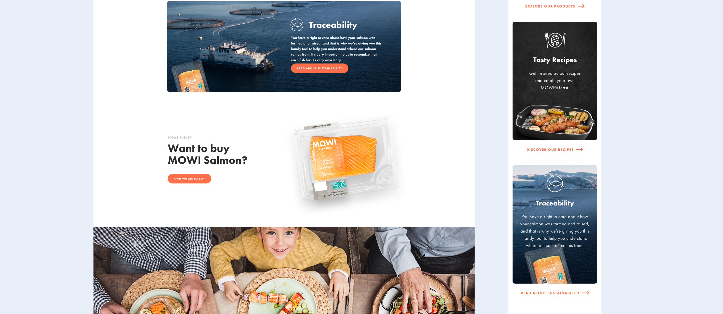
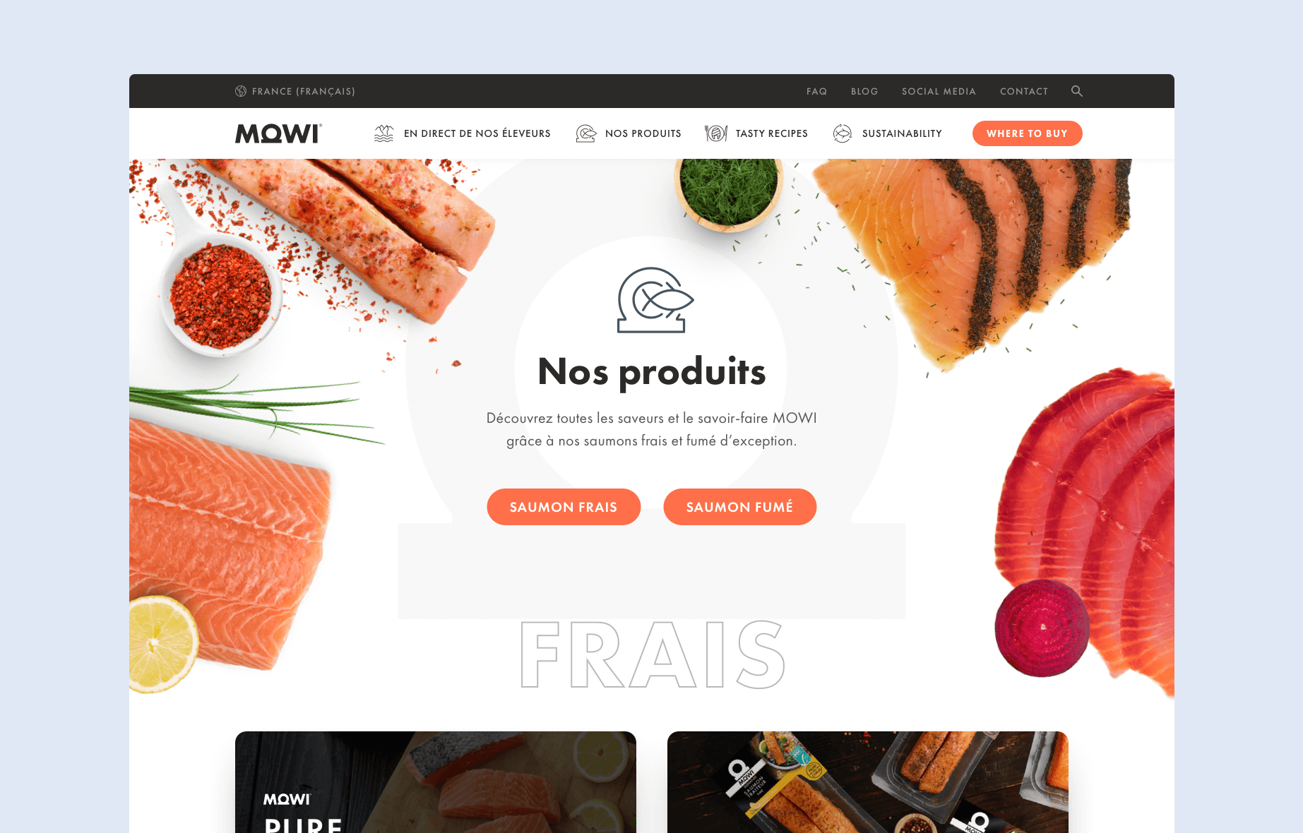
Mowi bases its consumer communication on four key elements that align with its values: "We care," "Our products," "Tasty recipes," and "Sustainability." These pillars convey the company's commitment to quality, transparency, and responsible practices.

Scroll right
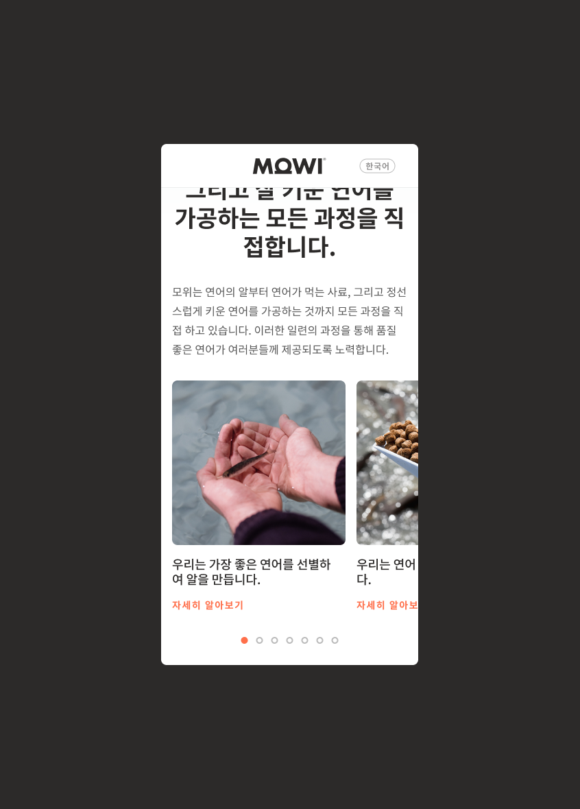
4 pillars subpages in mobile view
Views from "Our Products" subpages

Mowi consumer website is not just a platform to showcase the brand and its product catalogue. Based on consumer research supplied by MOWI, I designed it to be a helpful companion throughout the customer's experience before and after purchase. That includes features such as:

Store Finder

The Store Finder tool allows customers to easily locate and navigate to the nearest stationary stores carrying Mowi products and find online vendors that offer MOWI salmon for purchase.

Traceability Tool

By scanning the QR code on the MOWI packaging, customers can access information about the products they have purchased, such as where the salmon was born or the temperature of the sea it grew in.

This feature allows customers to know more about the product and offers extra content like recipes recommended for the product or other products to discover and purchase.

Nutrition Information

Mowi puts a strong emphasis on the health aspect of its products. Each product page on the new website provides detailed nutrition information compliant with FDA requirements. This allows customers to make informed decisions about their seafood purchases.

Recipes

MOWI wants to provide its customers with the best culinary experience. The website offers a vast collection of recipes. Users can easily find the perfect recipe to suit their preferences with filters or by using the traceability tool to find the best recipe for a product they bought.

After the launch on the US market, I collected and analysed data on website usage.

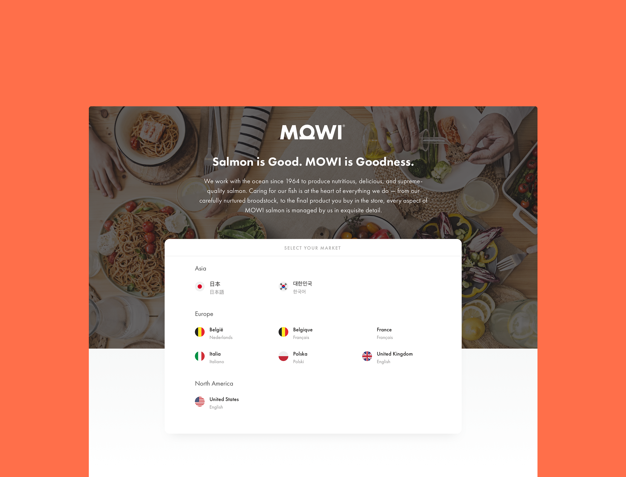
Based on these insights, I developed a set of guidelines for designing Mowi websites for other European markets. These guidelines included best practices for layout, navigation, typography, colour scheme, as well as functionality recommendations.

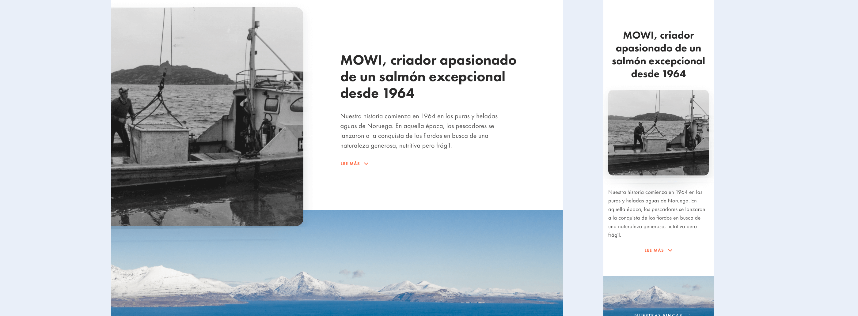
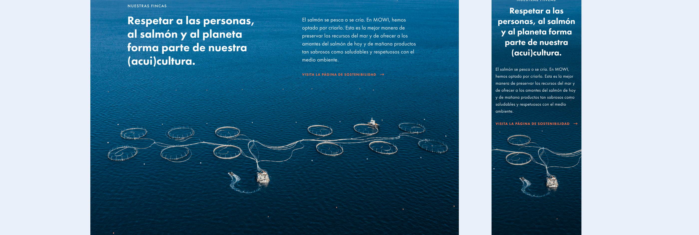
Based these guidelines, other designers created websites for the French, Spanish and German markets, with British and Polish markets launching in 2023. These guidelines ensure a consistent user experience and brand image across all the markets, while also allowing for some flexibility to cater to the specific needs of each market.